
Official brand resources
Built for conviction.
Branded for FUD.
The current visual identity for FUD Markets: logos, color, typography, and the essentials for consistent content.

01 / Identity
One unmistakable blue.
FUD Blue leads the system. White creates space. Near-black carries the message. Green and red are reserved for market direction.
Market signals
LONGGreen is positive direction.
SHORTRed is negative direction.
Typography
DM Sans
Clear, direct, and compact. Use it across headlines, navigation, body copy, and controls.
Aa Bb Cc Dd Ee
0123456789
0123456789
Numbers
JetBrains Mono
Use tabular figures for prices, balances, probabilities, shares, and P&L.
BTC$118,420.69+4.28%
ETH$4,269.00−1.32%
02 / Logos
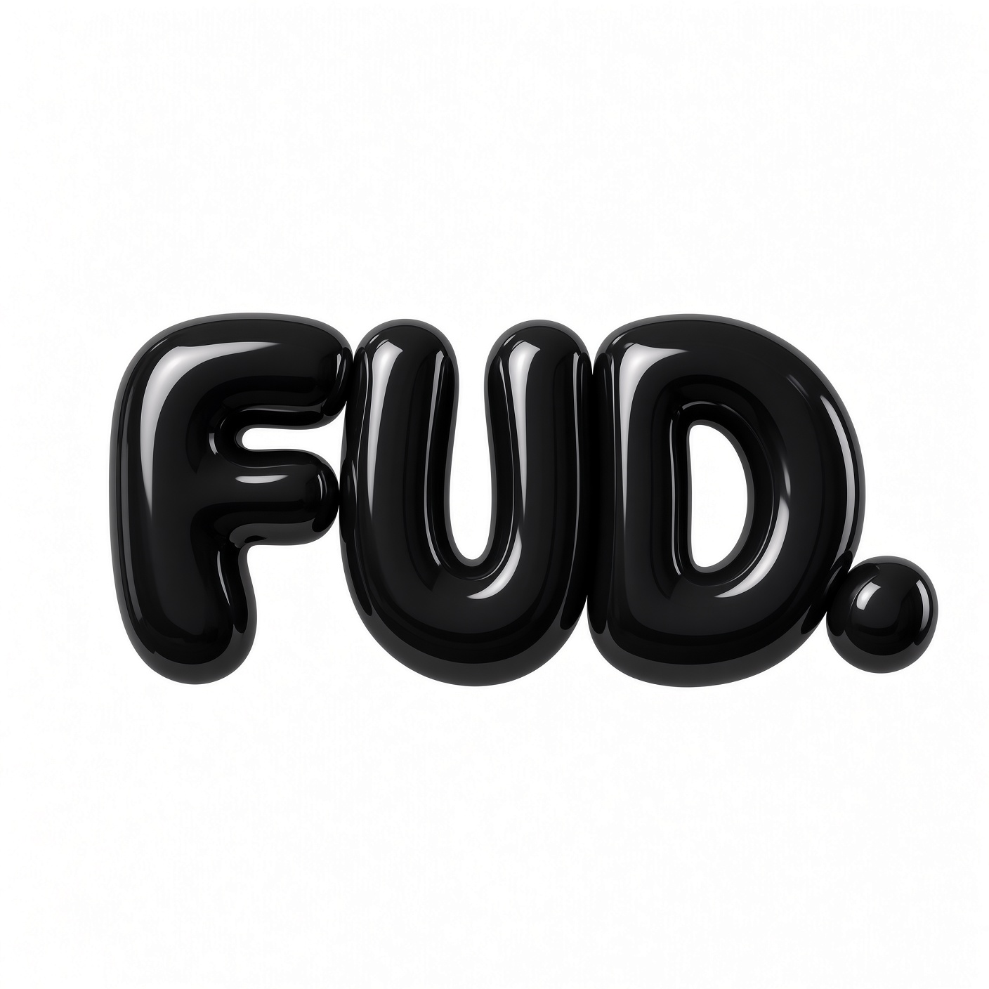
The mark, ready to use.
Choose the version that preserves contrast. Never stretch, recolor, outline, or add effects to the supplied artwork.
03 / Guidelines
Keep it sharp.
A few rules cover most marketing work. When in doubt, favor clarity and generous space.
Do use the originals
Download the supplied high-resolution artwork and preserve its crop, proportions, and finish.
Do leave breathing room
Keep clear space around the mark equal to at least the height of one letter stroke.
Don’t invent variants
No new colors, gradients, shadows, outlines, rotations, or reconstructed wordmarks.
Don’t confuse signals
Blue is the brand. Keep green and red for LONG, SHORT, gains, losses, and directional data.
Voice
Short. Confident.
Trading-native.
Say thisMake a call. Own the outcome.Clear, active, and specific.
Avoid thisRevolutionize your financial journey.Generic promises and empty hype.